 Tim looks at why becoming a news blogger is hard work and how simple changes to page layouts and designs can attract and promote your news blogs or any site even if he doesn’t use all the tricks himself.
Most bloggers dream of becoming a major source of news and information, millions of visitors and loads of links when you break yet another story. The pace is fast and furious with near daily race to be the first to get the scoop much like traditional media journalism. A vast quantity of front page traffic on Digg and other social sites is from the same websites time and time again but breaking into the exclusive group of true news bloggers is hard work but I hope some of these handy hints will help.
Why do it?
Before we go further you need to stop and take a step back becoming a news blogger is not suitable for all but a minority, go back to those top sites and you will realise nearly all of them are run by a team. With 24 hours in a day a single person can only do so much, and such sites rarely pay for themselves until they reach a certain critical mass. That said the one page tips I’m presenting will help any blogger interested in attracting the social media visitor.
Getting the page ready
How you present your exclusive story will often make or break your site above all you want people to know what the story is as quickly as possible, using stumblers as our basis you have 5.5 seconds to impress or they are gone.
Images
In many ways are the secret weapon of the news blogger and bloggers in general they add something to the story but they are also a useful social media tool.
Primary Image – this is the main image to accompany the article for maximum effect you want to turn this image into a promotional tool, when people photo blog a review on StumbleUpon the chances of a visitor clicking through from the reviews home page is 25% more likely then a standard review. To maximise people using the image as a photo blog picture make sure the image is under 250k and less then 500px width. Include some sort of identifier and don’t be afraid to include words (just make sure you use your alt tags correctly). When it comes to picture nearly all social media users like BBS big bold and simple a slightly risky strategy is to place the primary image just on the fall of the page to force the user to scroll down to see all the image.
Logo Image – A logo image is an image that appears near the top of the post to help categories and give a post a sense of identity, this further helps to cement in the visitors mind what the article is about as well as providing another promotion point. Google news has for a while now been using an algorithm to select suitable images for use within its site for relevant headlines, this sadly may not interest most wannabe news bloggers who don’t make it onto the Google news pages but the use of such images on Digg certainly will. Since the release of the new picture enabled Digg, users when selecting stories have been offered the option of including a picture from the page if and when a suitable image has been found. 
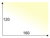
The important thing here is getting the scale right Digg currently is resizing images to 160×120 pixels and is only presenting users with the option of JPG so the ideal logo image should be 160×120 JPG, of course you need to make it interesting enough for the submitter to include it and remember to keep it inoffensive to avoid moderation.
Extract/Summary
Many Stumblers and Diggers simply copy the first few lines of an article when reviewing/submitting so make those lines count. Present an interesting and complete first 2 sentences be it a summary or some sort of opening statement. Just remember to keep it short and sweet otherwise the submitter or the site they are submitting you to will cut it off mid flow.
Typography
I am not a designer but subtle use of modern design concepts such as the use of grids really helps a story along. Don’t let a bad design or typography let your story down because it makes the process to hard to read. One technique borrowed from traditional magazine I find extremely useful is pull out and block quotes. While block quotes have a dedicated tag in html pull quotes do not but there are plenty of Javascript pull quote scripts you can use.

Printing
People still like something tangible so along with good typography a clean way to print the article out is essential at minimum a print.css but also think about promoting printing through a print button.
Social media buttons

Adding pretty icons and badges has been all the rage for a while now even the BBC have got social media badges on some of their pages, but there is no real evidence that this “bookmarking” buttons actually increase the number of people bookmarking sites and can have a very negative effect. On the whole social bookmarking do not cause any ill effects with possibly two exceptions
![]() 0 Diggs – Nothing says newbie who can’t fix their template then a Digg button with 0 Diggs, it’s a complete turn off. Social media users tend to flock or hunt in packs a button with a low score can put people off, If you are going to use Digg buttons then only place them on your post at the 20+ mark and make sure you remove them after a few days or immediately after your article is buried no point wasting your users time which could be spent viewing more of your content. You will of course point to the bottom of this page and scream hypocrite what else can I say but bah!
0 Diggs – Nothing says newbie who can’t fix their template then a Digg button with 0 Diggs, it’s a complete turn off. Social media users tend to flock or hunt in packs a button with a low score can put people off, If you are going to use Digg buttons then only place them on your post at the 20+ mark and make sure you remove them after a few days or immediately after your article is buried no point wasting your users time which could be spent viewing more of your content. You will of course point to the bottom of this page and scream hypocrite what else can I say but bah!
 Stumble Me buttons – When StumbleUpon produced a series of buttons people raced of to use them on their blogs without thinking through the consequences. Call it a bug or a protection feature if you like, but Stumble Me buttons are worthless. Every time a user uses your stumble me button to leave a review you lose a potential thumbs up. This is because when you leave a review it does not also thumb up the page as well, so while you might get a couple of hits from peoples home pages on StumbleUpon you will not receive any additional toolbar traffic.
General tips for news blogging
Apart from on page issues some simple things make a large difference in News Blogging
- Work in a team
- Be quick but accurate
- Moderate your comments
- Let others promote you, concentrate on getting the stories
- Don’t be afraid of scrapers always include good full internal links
- Be consistent unlike other forms of blogging news bloggers need to post regularly
Do you have what it takes to be a news blogger, and what type of news blogger are you a broad sheet or a tabloid?

I got 50 votes (thumbs up) on one article and saw little toolbar traffic.
I got 10+ reviews on one article and traffic went viral.
What really controls the toolbar traffic?
I think toolbar traffic becomes viral with the combination of votes and reviews. Question is how to get someone who votes to also review or the reverse?
You would think that the friends that you partner with in Stumbleupon would vote and review, but they don’t for the most part.
Something to think about.
If you set a more moderate goal, like “being a news source once a week” you can do it as a normal blogger too. Just think about what (an instance of) you know before everybody else. Even if it’s just something that can only happen to you.
These tips should help regardless of what type of blogger you are. Particularly the image tips, ironically I included a couple of the tips with this post including the extract which normally works so successfully yet almost no one has used it 😉
Formatting tips are helpful but I don’t think they’re really that essential when it comes to breaking news.
The only crucial part is to have a good summary or opener because most social users need that text to push a piece of content.
There are a bunch of other factors which I think are far more important than the way you design your page.
One of them is the necessity of controlling distribution: If you have influencers in your pocket, you can ‘own’ the news item even if you are not the first.
The post was inspired by work for a client and was what worked for them. The images made a huge difference (in comparison to the extract) having a primary image that was easy to stumble saw the largest increase and I suspect a post logo is going to become more and more important now that Digg has a thumbnail option. Not particularly because Digg is a good source of traffic but because now they have started you can be sure virtually every Digg clone will follow suit.
How you get your stories is another post in itself and beyond my expertise but I’m sure another collective thoughts member will take on the challenge.
Ok, thanks tones for your insight. You convinced me to delete Stumble me button from my site.
Pingback: Social Media Logo Images « The Venture Skills Blog